Learn how to make neat-looking slides and present them effectively using Figma.
I get it. Since you discovered Figma, you got used to all its benefits and you find all the other tools to create visuals simply “not good enough”. You want to make pretty-looking slides but Powerpoint or Google Slides keep on putting limits on your imagination and effectiveness.
Well- not to worry about it, you can make your slide deck in Figma. This post sums up tips on how to make beautiful presentations in Figma fast, effectively, and how to present like a pro.
Tip: Before you start, make sure to grab the Figma community file for this guide.
What you’ll learn here
- How to work with Figma frames
- Useful tips for designing the slides
- The quickest way to add icons and illustrations to Figma
- How to adjust the graphics without disrupting them
- How to present with Figma (with a useful hack)
1. Start with frames
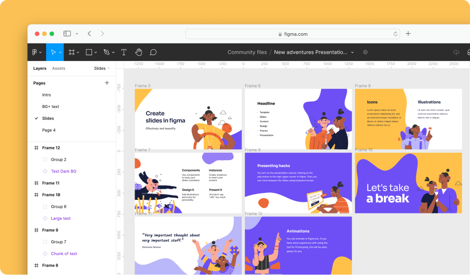
To create the slides use Figma frames. You can make a frame with the frame tool, which is enabled by hitting the F key or simply choosing it from the menu. Every frame will become a slide in the final presentation.
As the name suggests, frames create a sort of a border for your slides and all content you’ll drop and move to it will become part of the frame.
The ideal dimensions for each slide (and therefore frame) are 1270 x 720 px.
Ordering slides
Once you get to the presentation view, the slides will appear ordered based on their coordinates on the canvas. First, by x-axis from left to right, and then by y-axis from top to bottom.
That means if your slides are in two rows, the ones in the upper row will be shown first, from left to right, and the view will continue to the second row, again left to right — kind of like when reading a book.
Find the Frame tool in Figma
As the name suggests, frames create a sort of a border for your slides and all content you’ll drop and move to it will become part of the frame.
The ideal dimensions for each slide (and therefore frame) are 1270 x 720 px.
Once you get to the presentation view, the slides will appear in the order you have the frames numbered in the Figma file, so it’s best to create them in the order you want to present them or make sure they are numbered correctly.
Tip: Check Clip content in the right-hand side panel when the frame is selected. The graphics and shapes you’ll use will not be going over the frame’s edges in your file.
2. Design the deck
The most fun part- at least for me :). I always start by choosing the color palette for the project. I use site coolors.co to get inspired.
The color palette I used for the slide deck
Then, I set up the slides by placing text snippets and maybe background patterns or shapes, so I have an idea of the style of the final presentation.
3. Add icons and illustrations supa-fast
Nice icons and illustrations always make your slides more interesting and key points memorable. With Iconfinder’s copy-to-clipboard feature, you can copy and paste them to your Figma file super-quickly.
Tip: Go download the free illustrations pack used for these slides.
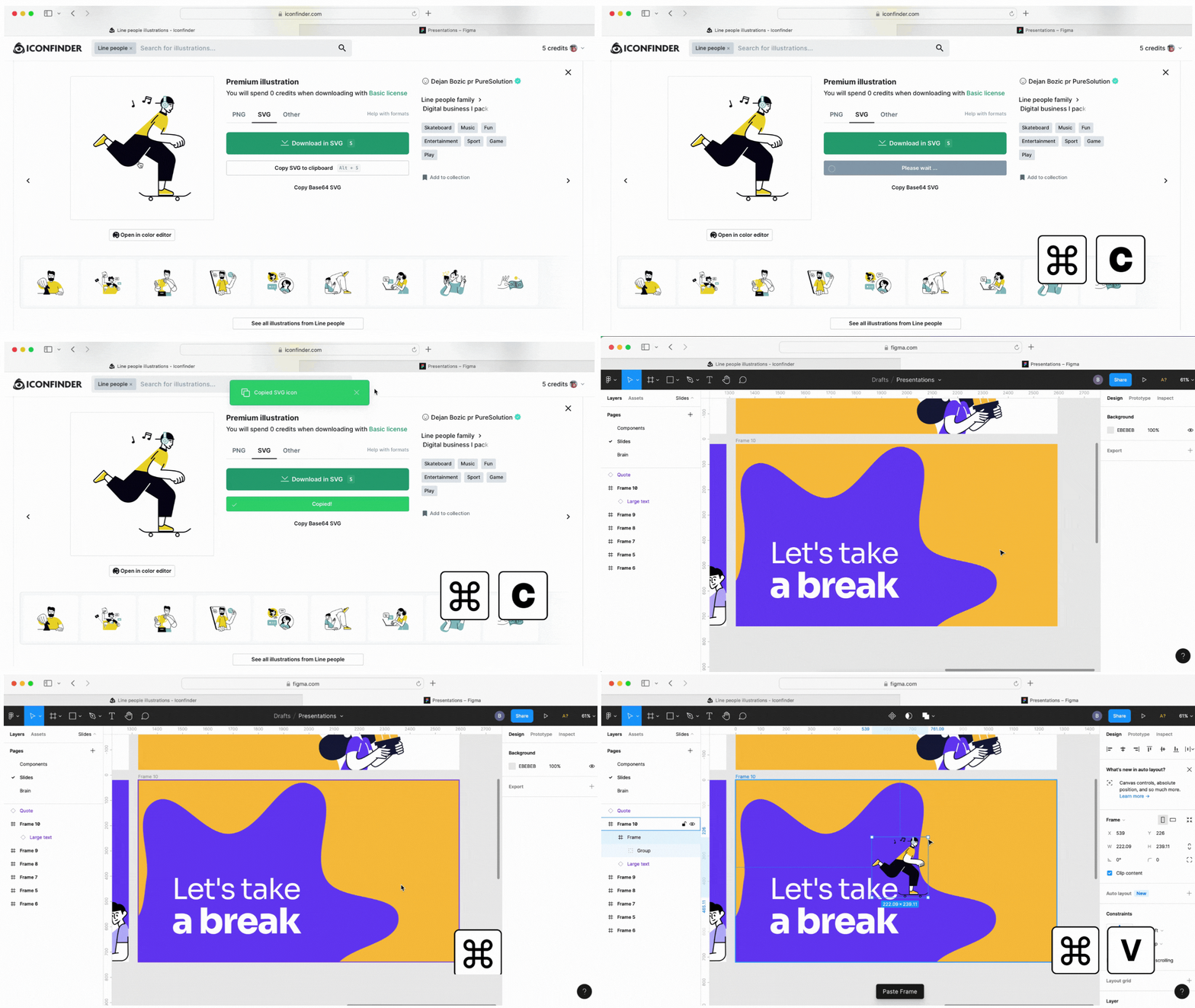
- Go to Iconfinder and find the graphic you’d like to use.
- Hover over the chosen item and press
⌘+Con Mac andCtrl+ Con Windows. The format that is chosen will be copied to your clipboard. I recommend copying SVG. It’s better quality and you can easily change the colors to match your design then. - Paste it into your Figma file.
It’s super-quick!:) And you don’t need to install any plugins. You just need to be on a Pro plan to be able to do this, so if you’re not a Pro subscriber, you can jump on a 7-day free trial and give it a go.
4. Adjust the graphics
Resizing
Make sure to use the Scale tool in Figma when you are enlarging the graphics or making them smaller. You can enable it by hitting the K key or choosing it from the menu (under the cursor icon). By using this tool, you will keep all properties of the graphic intact.
Recoloring
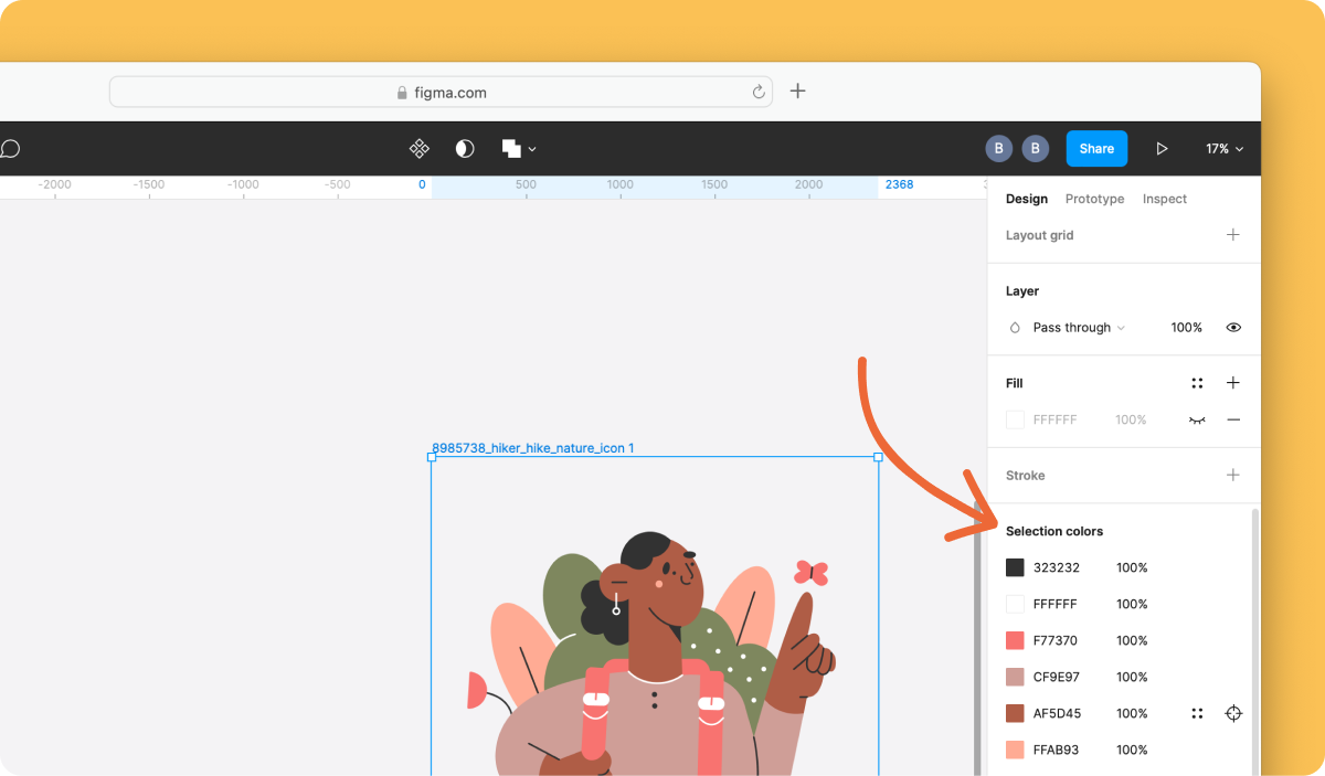
If you want to make the illustrations or icons match your color scheme, the quickest way is to find Selection colors when an item is marked, choose the color you’d like to change, and pick a new one that matches your palette.
This way, you will recolor all elements with the same color within the graphic.
5. Present like a pro
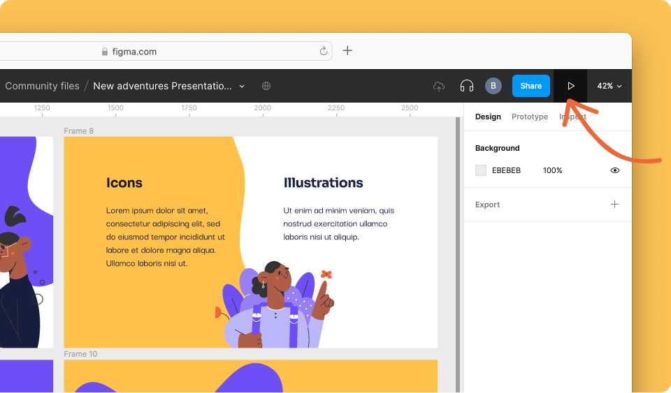
You turn on the Presentation view by clicking on the play button in the right upper corner in Figma. Then you can move between the slides using keyboard arrows.
If you want to share your slides made in Figma you can generate a sharing link under the blue sharing button. If don’t want to show off the whole Figma file add ?viewer=1 at the end of the sharing link URL. That way the user on the other end will only be able to access the file in the presentation view.
 By Bianka
