 By Bianka
Similar to fashion, graphic design trends are changing fast, and with the ever-evolving digital world, it is more and more important to stay up to date with what’s in the course.
Visual trends 2023
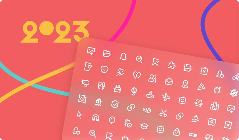
Our colleagues from Freepik have created a beautiful overview of their predictions for the Digital visual trends in 2023.
They covered everything from what’s fly in the world of photography, color palettes, vectors, and icons to mockups, templates, and more in a very creative and engaging way. Trust us - you want to see and play around with this amazing page. Take me there →

Icon trends
In the icon world, the focus is currently on modern-looking outlines that are often used in bright colors, which adds a bit of liveliness to plain and simple designs. Let’s look at examples from some well-executed websites with nice iconography so you can get inspired.
Todoist or notodoist?
We say Todoist all the way. The design on this website is done with so much love that we want to hug the screen. Even though it has been a while since Sam Beck created these icons, they are very “in” right now. They are outline, minimal, with a slight hint of cartoonish style, and used in tiny sizes. Applying them as a subtle pop of color on the site here and there is like a cherry on top of a great UI. The whole look of the site is super clean and neutral, and this tiny outline icon style adds just the right amount of detail.

Using outline icons in small sizes can be risky as they can become unreadable. But, no need to worry; we found a few outline packs from Iconfinder that will also be a hit if used tiny in your designs.
Basicons by Danil Polishin
.png")
Download icons from the Basicons family
Outline by Rolas Design

Download icons from the Outline family
Twitter redesign
In October 2022, Twitter introduced new icons for their UI, and they received a fair amount of criticism, but we like them.
The whole pack has adapted more modernity by losing the “traditional” look of elements and applying bulkier, and rounder shapes. They went after a bolder look by changing the stroke width from 1px to 2px.
.png")
Combining these with sharply edged details, the creators from Iconists have managed to modernize Twitter’s iconography while keeping the set cohesive and the feeling of the UI unchanged.
.png")
If you like the new Twitter icons look too and want to use bolder, modern icons with sharp edges in your designs, here are a few packs from Iconfinder that you can use.
Rudy by Icojam
.png")
Download icons from the Rudy family
Fortis by TanahCon
.png")
Download icons from the Fortis family
Where to next?
Staying faithful to the outlines, another super lovely design update has been done by Airbnb.
Earlier this year, they changed the icons representing the destination categories on their website and in the app. This beautiful pack made by Alana Hanada and Ashley Gaunt is a combo of the sharp-edged trend with a few slightly cartoonish elements, making the icons timeless.
.png")
The icons are clean and simple, yet they offer enough detail to represent specific destination types.

If you’re looking for icons similar to these, check out these families on Iconfinder:
Line UI by Kreev Studio

Download icons from LineUI family
Tracci Icon Series by 13.tree design

Download icons from Tracci family
Overall, the design trends circle around modern-looking outline icons, and we can't get enough of them.
We're curious about your favorite icon family or website that uses icons you like. Let us know in the comments below.
Freepik Visual Trends 2023
Head over to the fabolous Trends 2023 page from Freepik. Get inspired and start designing with a long list of freebies.